Leveraging the visual power of your Facebook Page cover with interactive capabilities can be a game-changer in your digital marketing strategy. But how can one maximize this asset to be visually pleasing and highly functional? We’re about to guide you through a transformative process to make your Page cover an interactive, clickable banner.
By default, Facebook Page cover images are static; they serve the aesthetic purpose of branding and visual representation. However, they possess potential beyond mere digital decoration. They can be made interactive, and in marketing terms, that translates to ‘clickable.’ A clickable cover means that when a user clicks on the image, they are directed to another section of your Facebook Page or an external website, depending on how you set it up. This ability to redirect users at a single click offers an innovative method to increase engagement, drive traffic, or boost conversions.
Step-by-Step Guide to Creating a Call-to-Action on the Cover Image
Turning your Facebook Page cover into a clickable banner involves several strategic and technical steps.
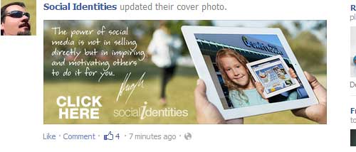
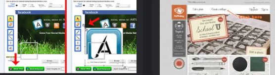
- Select a Relevant Image: Choose an image that aligns with the message or action you want to promote. It can be a newly launched product, an upcoming event, a popular blog post, or other marketing material.
- Add a Call-to-Action (CTA): Incorporate a clear and compelling CTA within your image. The CTA should guide users toward what you want them to do upon clicking. Examples include „Learn More,“ „Shop Now,“ „Sign Up,“ or „Contact Us.“ Make sure the CTA is visually prominent to catch user attention.
- Upload the Cover Photo: Upload the image with the embedded CTA as your Facebook Page cover.
- Add a Description with a URL: After uploading, click on the cover photo to open it in the photo viewer. Here, edit the description to add marketing text and a URL to which users will be directed upon clicking. It could be a link to your website, a specific product, a registration page, or any other relevant landing page.
To better visualize these steps, here’s a two-column table:
| Step | Action |
|---|---|
| 1 | Select a Relevant Image |
| 2 | Add a Call-to-Action (CTA) |
| 3 | Upload the Cover Photo |
| 4 | Add a Description with a URL |
Importance of Adding Marketing Text as the Description for the Image
Marketing text is the linchpin that combines the visual and interactive aspects of your clickable banner. It provides context for the user, bridging the gap between the image and the linked content. This text aids in guiding the user through the narrative you are building around your CTA and eventual destination. It should be crafted compellingly and concisely, stoking curiosity and incentivizing clicks.
You enhance the image’s clickability by including a link in your description. This integration transforms your static image into a dynamic portal, offering value beyond the visual and opening a path to further engagement or conversion. Your marketing text, therefore, plays a crucial role in leveraging the power of your clickable Facebook Page cover.
Advanced Techniques to Enhance Clickability

Unlocking your Facebook Page cover’s full potential requires understanding more nuanced techniques. The goal? To maximize the power of the clickable banner and create a seamless user experience. Here, we’ll dive deeper into these advanced methods and help you implement strategies that amplify clickability.
A. Introduction to Advanced Methods to Enhance the Clickable Banner Experience
Effective use of the clickable banner requires a blend of creativity, strategic positioning, and an understanding of user behavior. Advanced methods to boost the clickable banner experience include:
- Optimizing the placement of the call-to-action (CTA).
- Crafting engaging CTAs.
- Ensuring the aesthetics of your page remain intact while pursuing these enhancements.
Strategic Placement of the Call-to-Action
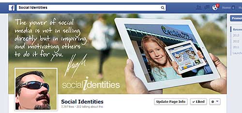
The position of the CTA on your cover image plays a significant role in its visibility and, subsequently, the level of user engagement. One must consider the profile picture overlay, which can potentially obscure parts of the cover image. Thus, strategically positioning your CTA to avoid this overlay can make a notable difference in the effectiveness of your clickable banner.
Here are some essential considerations for CTA placement:
- Avoid the Lower Left Corner: This is where the profile picture appears. Any CTA placed here might get hidden.
- Consider User Reading Patterns: Studies have shown that users often scan websites in an ‘F’ or ‘Z’ pattern. Placing your CTA along these reading paths can increase its visibility.
- Leverage the Center Space: The center of the image is typically free from overlays and draws attention naturally. Utilize this space for impactful CTAs.
The below table encapsulates these considerations for strategic CTA placement:
| Placement Tip | Explanation |
|---|---|
| Avoid the Lower Left Corner | Profile picture may obscure the CTA |
| Consider User Reading Patterns | ‘F’ or ‘Z’ scanning patterns can influence CTA visibility |
| Leverage the Center Space | Central placement draws natural attention |
Techniques for Making the Call-to-Action More Attractive

Attractiveness is not just about visual appeal but also the ability to evoke action. Here are techniques to make your CTAs more attractive without disrupting the aesthetics of your page:
- Use Contrasting Colors: Make your CTA stand out against the background of the cover image with contrasting colors. It makes the CTA pop and grab attention.
- Employ Compelling Text: Craft text that provokes curiosity creates urgency, or offers value. Such text is more likely to elicit a click.
- Opt for Clear Fonts: Choose a font that’s easy to read and matches your brand’s overall aesthetic.
- Add Visual Cues: Arrows or other visual indicators can subtly guide the viewer’s eye toward the CTA.
For reference, consider the following table that illustrates these techniques:
| Technique | Action |
|---|---|
| Use Contrasting Colors | Choose colors that make the CTA visually pop |
| Employ Compelling Text | Craft text that provokes curiosity, creates urgency or offers value |
| Opt for Clear Fonts | Select a font that’s easy to read and aligns with your brand aesthetic |
| Add Visual Cues | Use arrows or other indicators to guide the viewer’s eye toward the CTA |
These techniques serve as a roadmap to creating an effective clickable banner. By considering the strategic placement of your CTA and making it attractive and engaging, you unlock a new level of interactivity for your Facebook Page cover, enhancing user experience and engagement.
Strategic Use of Marketing Text
The power of a clickable banner is only fully harnessed with the right words to guide user interaction. It is where the strategic use of marketing text comes in. Marketing text can lead the user journey, encourage clicks, and drive conversions when used effectively. In this section, we’ll delve into the importance of marketing text and offer tips on crafting compelling narratives that influence user behavior.
Why Marketing Text is Crucial for a Clickable Banner
The application of a clickable banner extends beyond mere aesthetics; it serves as a vital marketing tool. The use of well-crafted marketing text in the banner image’s description provides context and entices users to engage with the content. In essence, this text acts as the verbal call-to-action (CTA) that complements the visual appeal of the banner.
Practical marketing text grabs attention, generates interest, sparks desire, and prompts action. By incorporating enticing narratives, you’re steering users to take the desired action – visiting a specific webpage, signing up for a newsletter, or partaking in an event.
Crafting Engaging Marketing Text that Encourages Clicks
Creating compelling marketing text is an art that blends creativity and strategic messaging. Here are some tips for writing engaging marketing text:
- Keep it concise: In the fast-paced world of social media, short and impactful phrases often have the most impact.
- Focus on benefits: Highlight what users stand to gain by clicking on your banner.
- Create a sense of urgency: Encourage immediate action using time-bound phrases like ‘limited time offer,’ ‘only a few left,’ or ‘offer ends soon.’
- Personalize the message: Make the user feel the message is tailored for them by using words like ‘you’ and ‘your.’
Below is a table that summarizes these tips:
| Tips | Explanation |
|---|---|
| Keep it concise | Short, impactful phrases often have the most impact |
| Focus on benefits | Highlight what users stand to gain |
| Create a sense of urgency | Encourage immediate action with time-bound phrases |
| Personalize the message | Use words like ‘you’ and ‘your’ to make users feel the message is for them |
Including Valuable Links within the Marketing Text and Optimizing Their Visibility
Including valuable links within your marketing text provides a direct pathway for user action. When a user clicks on your banner, the description—complete with your marketing text and links—will appear next to the image in the photo viewer.
Optimizing the visibility of these links is crucial. Here are some tips:
- Make links descriptive: Instead of ‘click here,’ use text that describes where the link leads to, such as ‘Explore our new collection.’
- Place links strategically: Position your most important links early in the text to catch the user’s attention.
- Use shorteners: Shorter URLs look cleaner and less spammy, improving the user’s perception of the link.
Here is a table that summarizes these key points:
| Link Optimization Tips | Action |
|---|---|
| Make links descriptive | Use text that describes where the link leads to |
| Place links strategically | Position important links early in the text |
| Use URL shorteners | Shorter URLs look cleaner and less spammy |
The strategic use of marketing text is vital in driving the effectiveness of your clickable banner. By crafting engaging narratives, focusing on user benefits, and optimizing links, you can enhance the user experience and drive the desired actions.
Subtlety in Call-to-Action Placement
As we delve deeper into crafting clickable banners, we explore the nuanced strategy of subtle call-to-action (CTA) placement. More specifically, we consider the approach of positioning the CTA under the profile photo. This method has been found to produce effective and less intrusive advertising results.
Strategy of Placing the Call-to-Action Under the Profile Photo

The profile photo area often garners significant attention due to its location and function as a recognizable identifier. Therefore, placing the CTA near the profile photo capitalizes on the user’s natural eye movement. Rather than blatantly plastering the CTA on the banner image, this technique subtly introduces the action to be taken, seamlessly integrating with the overall page aesthetics.
Benefits of This Strategy: The Element of Surprise and Less Intrusive Advertising
The primary advantage of this strategy is the element of surprise it brings. Users do not expect a CTA near the profile photo; thus, their curiosity may be piqued when they encounter it, leading to increased clicks.
This method also reduces the risk of ad fatigue. By subtly incorporating the CTA, it feels less like an advertisement and more like a natural part of the webpage. As a result, users may be more open to the message and are likely to respond positively.
Here’s a comparative summary of the advantages of this method:
| Benefits | Explanation |
|---|---|
| Element of Surprise | Users do not expect a CTA near the profile photo, leading to increased curiosity and clicks |
| Less Intrusive Advertising | By subtly incorporating the CTA, it feels less like an advertisement and more like a natural part of the webpage |
Step-by-Step Guide for Implementing This Strategy Effectively
- CTA Design: First, design a CTA that complements your profile photo and the overall page aesthetic. It should stand out and stay within the rest of the page.
- Placement: Place the CTA directly under the profile photo, aligning it to the center to draw attention.
- Brief and Clear Message: Ensure the text on the CTA is concise and communicates the action you want users to take.
- Test and Iterate: Use A/B testing to validate the effectiveness of your CTA placement and design. Collect data, analyze it, and refine your strategy based on the results.
This table presents these steps concisely:
| Steps | Instructions |
|---|---|
| CTA Design | Design a CTA that complements your profile photo and the overall page aesthetic |
| Placement | Place the CTA directly under the profile photo, aligning it to the center |
| Brief and Clear Message | Ensure the text on the CTA is concise and communicates the desired action |
| Test and Iterate | Use A/B testing to validate the effectiveness of your CTA placement and design. Refine your strategy based on the results |
By adopting subtlety in your call-to-action placement, you bring an element of surprise and create less intrusive advertising experiences, fostering a more user-friendly interaction.
Maintaining Aesthetics While Maximizing Marketing

One cannot overstate the importance of balancing design aesthetics and marketing potential in optimizing clickable banners. It becomes critical when dealing with the page cover, a potent marketing tool that still needs to maintain a high level of visual appeal.
Balancing the Design Aesthetics of the Page Cover with its Marketing Potential
While it’s tempting to transform the page cover into a full-fledged ad, we must remember the primary purpose of the cover – to visually represent the brand’s identity. Striking a balance means creating a design that captivates while subtly incorporating marketing elements.
For instance, instead of overtly advertising a product or service, use imagery that reflects the brand’s values, products, or services. You could showcase people using your product or embed subtle references to your service in the background. The goal here is to spark curiosity and encourage clicks without compromising visual appeal.
Incorporating Branding in the Cover Image While Maintaining its Functionality as a Clickable Banner
Incorporating branding in the cover image can be challenging, but it’s not impossible. The key is subtlety. Consider using brand colors, fonts, and symbols in the cover design, and align the visual elements with your brand message.
One method is to use a relevant, high-quality image as a backdrop and superimpose a semi-transparent version of your logo or a brand symbol. This way, the branding is present but doesn’t overshadow the overall design.
Here are some tips to consider when incorporating branding:
| Tips | Instructions |
|---|---|
| Use Brand Colors | Infuse your cover image with brand colors, but do so subtly to avoid overwhelming the overall design. |
| Brand Fonts | Use brand fonts sparingly to communicate any written message on the cover. |
| Symbols and Logos | Consider superimposing a semi-transparent logo or brand symbol, but ensure it doesn’t dominate the image. |
Tips for Maintaining a Consistent Look and Feel Despite Frequent Cover Photo Changes
Maintaining consistency in design despite frequent cover photo changes can be tricky, but it’s essential for brand recognition and user experience. Here are some steps to ensure a consistent look and feel:
- Color Consistency: Stick to your brand color palette. Even as the cover image changes, the color theme should remain consistent.
- Font Consistency: If you include text in your cover images, maintain font style and size consistency.
- Style Consistency: Establish a unique style for your cover images. It could be in image composition, use of icons, or how branding is incorporated.
- Brand Elements: Consistently include a specific brand element in all your cover photos, such as your logo, tagline, or symbol associated with your brand.
The following table outlines these points:
| Tips | Instructions |
|---|---|
| Color Consistency | Stick to your brand color palette across all cover images. |
| Font Consistency | Use consistent font styles and sizes in your cover images. |
| Style Consistency | Establish a unique style for your cover images, image composition, or icons. |
| Brand Elements | Consistently include specific brand elements in your cover images, such as your logo or tagline. |
Balancing design aesthetics with marketing potential is a delicate art that can significantly increase engagement and clicks when executed correctly. By incorporating branding subtly and maintaining design consistency, your page cover can become a potent yet elegant marketing tool.
Monitoring Success and Making Adjustments
Once the clickable banner has been implemented, the next crucial step is to monitor its success. How well it works can be measured by tracking various metrics, and continuous improvement can be made based on these analytics.
Monitoring the Success of Your Clickable Banner
We must track how users interact to ensure your clickable banner achieves its intended purpose. This interaction can be monitored using various tools that offer detailed analytics about website activity. These tools can track how many users click on your banner and how they navigate your website afterward.
But more than raw data is needed. We must analyze these metrics to draw meaningful insights to inform future improvements. An in-depth analysis can reveal patterns and trends that might need to be evident from a cursory glance at the numbers.
Metrics to Track: Click-Through Rate, Page Visits, and Conversion Rate
Several vital metrics can comprehensively understand your clickable banner’s performance.
- Click-Through Rate (CTR): This measures the precise percentage of people who click on your banner out of the total number who have seen it. A high CTR indicates a well-designed and positioned banner.
- Page Visits: This metric shows the number of users who visit your page after clicking the banner. If you’re attracting many page visits, your banner effectively generates interest.
- Conversion Rate: This measures the exact percentage of users who perform a favorable action (such as making a purchase or signing up for a newsletter) after clicking on your banner. A high conversion rate suggests that your banner is attracting more than just users but attracting the right ones.
The following table outlines these metrics:
| Metrics | Significance |
|---|---|
| Click-Through Rate (CTR) | Measures the percentage of users who click on your banner out of all who see it. |
| Page Visits | Shows the number of users who visit your page after clicking the banner. |
| Conversion Rate | Measures the percentage of users who perform a desired action after clicking on your banner. |
Making Adjustments Based on Analytics and Testing Different Strategies for Continuous Improvement
The world of digital marketing is dynamic, and even the most well-crafted clickable banners might require adjustments. Here’s how to use your analytics data for continuous improvement:
- Data Analysis: Analyze your metrics to identify what’s working and what’s not. For instance, you might need to rethink your banner design or placement if your CTR needs to be higher.
- A/B Testing: This compares two versions of your banner to see which performs better. You can test elements like the banner’s design, position, or call-to-action.
- Adjustments: Based on your analysis and testing, make necessary adjustments to your banner. It could involve changing the banner design, altering its placement, or tweaking the call-to-action.
Here’s a summary of these steps in a table:
| Steps | Actions |
|---|---|
| Data Analysis | Analyze your metrics to identify areas of improvement. |
| A/B Testing | Compare two versions of your banner to see which performs better. |
| Adjustments | Make necessary adjustments based on your data analysis and testing results. |
Monitoring success and adjusting is integral to achieving the most out of your clickable banner. By closely monitoring critical metrics and being responsive to their insights, you can ensure your banner remains an effective marketing tool.
The Journey Forward with Clickable Banners on Facebook
As we navigate the marketing landscape, one thing remains clear: Facebook page covers can serve as powerful, clickable banners with vast potential for enhancing our marketing strategies.
A Recap of the Journey
From the onset, we have navigated the ins and outs of converting your static Facebook page cover into a dynamic, clickable banner. The goal is to turn every visit to your Facebook page into a potential lead by creating an engaging and interactive user experience. With the right image, compelling message, and strategic link placement, your page cover can evolve from a digital billboard to an actionable marketing tool.
The following table summarizes the main points:
| Point | Description |
|---|---|
| Right Image | Select an image that accurately represents your brand and piques visitor interest. |
| Compelling Message | Include a call-to-action that motivates visitors to click on the banner. |
| Strategic Link Placement | Position your links strategically within the banner to guide visitors to the intended destination. |
The Path of Continuous Adaptation and Experimentation
The digital marketing realm is an evolving landscape. The tactics that work today may yield different results tomorrow. Thus, the need for constant adaptation and experimentation must be supported. Use analytics to monitor your clickable banner’s performance, conduct A/B tests to ascertain what works best, and do not hesitate to tweak elements as necessary.
Gazing into the Future of Social Media Marketing
The evolution of social media has revolutionized how we connect with audiences. As we look ahead, we can only anticipate that the significance of platforms like Facebook in marketing strategies will continue to soar. The clickable Facebook page cover is just the tip of the iceberg. We are on the verge of uncovering new, innovative ways to engage with audiences and convert passive social media interactions into active customer relationships.
To navigate this digital landscape successfully, staying up-to-date with the latest trends and adapting your strategies is critical. Remember, the path to easy success is not linear, and the ability to adapt to changing circumstances sets successful marketers apart. So, buckle up and prepare for an exhilarating journey ahead in social media marketing!